Color electronic paper represents the next milestone in energy-efficient display technology. In addition to its advantages of low power consumption and visibility in sunlight, color electronic paper must be capable of fully rendering the vibrant images found in LCDs and posters. This capability is essential for the technology to secure a position in applications such as advertising and smart retail, where color fidelity is of utmost importance.
We will explore the differences in full-color applications between E Ink's ACeP Gallery Palette, and the cholesteric liquid crystal (ChLCD) from IRIS Optronics using a selection of standard test images.
How E Ink ACeP Gallery works
The Gallery Palette features E Ink's ACeP (Advanced Color ePaper) technology, which consists of microcups filled with four ink particles: yellow, cyan, magenta, and white. By applying different voltages, these particles can be shifted to generate seven standard colors: black, white, red, yellow, blue, green, and orange.

When the electronic paper display needs to present colors beyond the seven specified, it requires precise blending of these seven colors to simulate similar hues when viewed from a distance.
The same ACeP technology is also used in the latest Spectra 6 e-paper.
How IRIS Oprtronics ChLCD color e-paper works
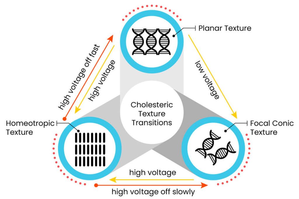
Cholesteric liquid crystal (ChLCD) e-paper has three layers of displays that reflect red, green, and blue respectively. The electric field alters the rotation of the liquid crystals that is bistable between the two states:
- The planar state has the liquid crystal particles lined up uniformly to reflect specific wavelengths of light, to form unique colors.
- The focal conic state lines up the liquid crystal particles in a way to let light pass through, displaying the colors underneath.

By independently adjusting the states of the three RGB liquid crystal layers, ChLCD can perfectly reproduce more than 16 million colors, creating a rich color image comparable to LCD.
The color testing experiment
To evaluate the color performance of ACeP and ChLCD, we utilized four representative images for testing purposes:
- Red, green, blue, cyan, magenta, and yellow shift across 16 levels to white or black, illustrating the consistency of color transitions in full-color technology.
- A fusion of orange, purple, blue, and green is utilized to evaluate the gradient effects of full-color technology in changing colors.
- A scenic image illustrates the effectiveness of the technology in representing natural landscapes.
- A portrait to evaluate the effectiveness of showcasing images of individuals.

Comparison of 16 levels of grayscales
When 16 levels of grayscales were displayed on the Gallery Palette of E Ink ACeP, there were 12 clear color divisions. However, the display did not effectively render cyan, which looked greenish, and purple, which seemed light blue. In addition to gaps in the color scale, the necessity of incorporating varying levels of white ink during the transitions contributed to a significant grainy appearance in the display.

Conversely, the ChLCD technology developed by IRIS Optronics could flawlessly showcase the colors in each row, ensuring that red, green, blue, cyan, magenta, and yellow were represented in their true colors.

Blending four colors
When displaying the gradient of orange, purple, blue, and green on an ACeP Gallery Palette, the lack of adequate ink colors necessitated the use of white in several areas to fill in the absent colors, which created distinct gaps in the palette's overall appearance.

With 16.78 million colors at its disposal, the ChLCD could seamlessly showcase a variety of mixed colors, effectively rendering combinations of orange, purple, blue, and green.

Differences in the scenery image
During the scenery image experiment, the Gallery Palette could not form bright greens and blues, leading to a muted appearance of the leaves and far-off mountains. In addition to a grainy quality, the overall effect evoked the look of a vintage photograph.

The vibrant greens and blues offered by the ChLCD displayed depth in the image, complete with vivid colors.

A human portrait
The limited E Ink Gallery Palette struggled to render facial shadows correctly, leading to a flat appearance and a somewhat washed-out skin tone. Furthermore, the hues of the blue and purple flowers surrounding the face also appeared dull.

On the other hand, the contours of the face and makeup were beautifully displayed on the ChLCD, while the blue and purple flowers in the background appeared lively and vibrant.

Based on the comparison of the two electronic paper technologies, cholesteric liquid crystal is more suitable for digital signage applications that require vibrant colors.
If you would like to know more about color e-paper applications, please get in touch with us.